
Monday, July 19, 2010
Hello everybody welcome to part #2 of the BLOOpress wordpress theme, today we’ll be converting the BLOOpress photoshop mockup into a one page CSS template. The CSS template will basically immertate the main page of our wordpress theme. Most of the styles used in the main page of our theme will be re-used over and over in other areas of the website. Right lets get started, create a new folder on your desktop called “BLOOpress” inside this folder also create another folder called “images”. Open up notepad then goto “file > save as” save the blank notepad document as “style.css” within the “BLOOpress” folder. Open up dreamweaver and start a new HTML document. Straight away goto “file > save as”, save the HTML file as “index.html” inside your “BLOOpress” folder on your desktop. Select the “code view” within the dreamweaver interface. Lets add our website title and link our style sheet just to get the ball rolling. In between the “TITLE” tag add your website title or what ever it is you want to be displayed in the main window. Then link your style sheet. You dont have to type out the whole line of text to add your style sheet, there are tools available within the dreamweaver application to automate this process. You can use this tool by rolling out the right panel by clicking the little grey arrow, once open click the little chain icon. I strongly recommend you get to grips with some of the tools within the dreamweaver application as they can make your life a whole lot easier, some of the tools include browser compatability tests as well as CSS/HTML validation. Okay lets get this template moving, open up your PSD in photoshop, zoom into the top left hand corner of the template, hide the top nav link text, the second nav link text, header rectangle and the website title including the pattern and shine effect. Select the rectangular marquee tool, at the top change style to “fixed size” enter the values 25px for the width and 225px the height. Goto “layer > flatten image” then make a selection like the image below (DONT SAVE PSD) Once you’ve made the selection like above goto “image > crop”. Now goto “file > save as”, save the image as “bg.PNG” in the images folder within the BLOOpress folder. Close your PSD FILE and head back over to dreamweaver lets start to mockup some of the layout in HTML. Take alook at the image below, this will give you some idea on how we will be doing it. In code we mock it up like this. First we make a container which will be the container which holds the whole site, we then add a DIV for our first navigation, a DIV for our header and a DIV for our second navigation. Inside our first navigation DIV we need to add a simple unordered list. Now we’ve mocked up some of the top half of the website lets begin adding our styles to our style sheet. Open up your style.CSS file and copy the code below, each style element is comment coded already for your convience. Most of the styles are pretty simple the only thing that may be different are the heights of the elements, depending on how you made your PSD file, you may want to double check the height of your navigations and header. Notice we left the header DIV blank, this is the next part we need to tackle. Open up your PSD file and select the header layer, make a selection of the whole header exluding all the header elements. Save the header background as “header_bg.PNG” inside your images folder. Depending on how big you made your header part, the height values may differ to mine. You may need to determine your header image height. We can then add our header styles to the CSS file. You may now test your HTML file inside your browser and see how it looks, heres a small screenshot of mine. The next item we need to tackle will be our website title, slogan and search field. Unfortunetly we aint going to be able to use plain text for the website title, so were going to have to use an image. Open up your PSD file, hide all yours layer apart from your website title, slogan, lines pattern and shine. Make a selection like the image below, NOTE ive left the background on so you can see the selection. Once you’ve made the selection goto “image > crop” save the image as “title.PNG” inside your images folder. Inside your “header DIV” create another DIV of title. Notice ive left a space inbetween the “title DIV” in this bit we need to add our title image. Now we’ve inserted our image we need to style our “title DIV”, head over to your style sheet, within the “header styles section” create a new style of “title”. For the title we need to float it left, add a fixed width and height which should be exactly the same as our image. We then need to add a top margin to push the title down so its kind of centered inside our header, the code looks like this. Check your website inside your browser to reflect the changes you just made. Once you’ve checked it and all is fine, create yea another DIV inside your “header DIV” called “search-from”. Inside the “search-form DIV” insert a text field and button. It doesnt need to be a valid form as the form will automatically be created in wordpress. On each field and button add a class that will be relivant to the certain item, ive used a class of “search-field” for the search field and “search-button” for the submit button. We now need to add our styling to the search field & button to match our PSD. The first item we will style will be the “search-form DIV”. The code looks like this. Now the form is postioned lets go about adding our styling to the text field and button. You need to add two classes into your style sheet. “.search-field” & “.search-button”. Lets style the search field first. The submit button or go button whatever you want to call it, is going to use an image as the button. Firstly we must open our PSD and make a selection around the button. Crop your PSD around your button then save it as “submit_bg.PNG” into your images folder. We now need to alter our search button code. Head over to your HTML file in dreamweaver inside the code view. We need to change the type from submit to image, then add our image url. The code looks like this. Then we need to add a single style to our “.search-button” class, which looks like this. Thats the header part pretty much finished, just one last item to finish off and thatst he second navigation. In the “nav 2 DIV” add a simple unordered list, you can use the class of “nav1-links” for this menu also. The code looks like this. We have already set out some styles for a nav2 DIV, all’s we need to do is add some top padding to center the navigation links. Okay now for our content area which will contain our main posts and sidebar. Each wordpress post will look like this. In code we lay it out like this. we start by making a DIV of left content, which is where all our main posts within wordpress will lie. We then make 2 class DIV’s for our main post box, and our post thumbnail. Inside the class “post-thumb” ive added a example thumbnail using the actual size i made it on the PSD file. We will remove the thumbnail from the code when were coding it to wordpress. Lastly we add another class which is for our post footer. Now for the styles. Once you’ve added the styles you can test your template inside the browser. Still with our content box we need to add our post-title and some example post text. Underneath your “post-thumb class” add another class called “post-title”. Inside the class “post-title” also wrap an exaple header in a H1 tag. The styling for our “post-title” and H1 tag looks like this. Test your template inside your browser, you should now have an example post title, heres how mine looks in IE7. We can now add our example paragraph to our example post. Similar to what we did above, underneath our post title class we need to add another class called “post-content” inside the post-content class add a simple P tag with an example paragraph. The code looks like this. We can then begin to style our “post-content class”, which looks like this. Finally underneath your post-content class there should be a class called “post-footer”. Inside this class add a simple paragraph saying “104 Comments | Posted on 16/04/09 @ 10:38am”. Or something similar, in wordpress it will all be replaced with PHP code. Before we add our styling to the post-footer class we firstly need to make the post footer background. Head over to your PSD file and make a selection like this. Once you’ve made the selection goto “layer > flatten image” Once flattened goto “image > crop”. Save the final image as “post_footer_bg.PNG” inside your images folder. Then add these styles to your “post-footer class”. Test your template in your browser to see how everything measures up. Heres mine. To add an extra 2 posts underneath each other you need to copy from the class “post-box” to the ending DIV of “post-footer” then just paste the text underneath all the code for the first box. Right lets get one with the sidebar area. Underneath the ending DIV of the “left-content DIV” add another DIV called “right-content”. Add these styles for the right-content DIV inside your stylesheet. Inside your “right-content DIV” add another DIV called “stay-connected”. We need to now extract the background from our stay connected box within our PSD file. Make a selection like the image below, miss out the stroke that is applied to the box. Save the image as “stay_connected_bg.PNG” inside your images folder. We now need to add our styles for our stay connected box. Head back over to your HTML code, inside your “stay connected DIV” add a h1 tag with the text “stay connected”. Inside your style sheet add the styles for your H1 tag. The next part will be adding the icons to our stay connected box, but first we must save them as individual images from our PSD file. Copy and paste your icons to a blank canvas of 30px x 30px you may need to resize them abit. Make sure your icons are on transparant backgrounds then save them as what_ever_icon.PNG inside your images folder. Once you’ve sorted all your icons head back over to your HTML code. Underneath your H1 tag we need to add another two CLASSES, a class of “sc-icons” and “icon-text”. Inside the “sc-icon” class add your icon, inside the “icon-text” class add to P tags each with a class to represent each P tag. We style these classes like this. Now you need to duplicate the code for the icon and text to add further icons, making sure you change the image SRC to another icon. The code looks like this. Test your template to see if any changes need making, mine loads up fine in IE7 and firefox. Heres my preview in IE7. The rest of the sidebar we’ll make when we move it over to wordpress. Now for the footer, firstly we need our repeated background image from our PSD… you should know how to do that by now. Goto your HTML code UNDERNEATH your ending container DIV draft out your footer. We need two DIV’s one for the footer background and another one for the actual footer. Inside the actual footer we need to add two P tags with a class. The styles for our footer are as follows. CONGRATULATIONS, you’ve completed the conversion to CSS. I hope you’ve enjoyed this tutorial, dont forget to subscribe via RSS and twitter. Next time we’ll be converting it into a live wordpress theme.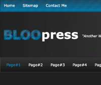


<title>BLOOpress "another wordpress blog" | Welcome...</title>

<link href="style.css" rel="stylesheet" type="text/css" />


</head>
<body>

<div id="container"><!--container starts-->

<div id="nav1"><!--nav1 starts-->
<ul class="nav1-links">
<li><a href="#">Home</a></li>
<li><a href="#">Sitemap</a></li>
<li><a href="#">Contact Me</a></li>
</ul>
</div><!--nav 1 ends-->

<div id="header"><!--header starts-->
</div><!--header ends-->

<div id="nav2"><!--nav2 starts-->
</div><!--nav2 ends-->

</div><!--container ends-->

</body>
</html>/* ------MAIN STYLES------ */
*{
padding:0;
margin:0;
}
body {
background-color: #202020; /*sets background color for the whole website*/
font-family: Verdana, Arial, Helvetica, sans-serif; /*sets font family for the whole website*/
font-size: 12px; /*sets a font size of 12px for the whole website*/
color: #FFFFFF; /*sets default color of text to white*/
background-image: url(images/bg.png); /*our repeated background image*/
background-repeat: repeat-x; /*repeats background horizontally*/
}
#container {
width: 900px; /*sets a website width of 900px*/
margin-right: auto; /*centers website*/
margin-bottom: 40px; /*adds 40px margin to the bottom*/
margin-left: auto; /*centers website*/
}
/* ------NAV1 STYLES------ */
#nav1 {
float: left; /*floats nav1 left in the container*/
height: 26px; /*gives nav1 a height of 26px*/
width: 900px; /*gives nav1 a width of 900px*/
padding-top: 10px; /*adds 10px padding to the top*/
}
.nav1-links li{
list-style:none; /*removes bullet points from list*/
display:inline; /*displays links horizontally*/
}
.nav1-links a {
color: #FFFFFF; /*sets nav links to white*/
font-family:Verdana, Arial, Helvetica, sans-serif; /*sets nav1's font family*/
font-size: 12px; /*sets nav1's font size*/
text-decoration: none; /*removes underline from links*/
padding-right: 20px; /*adds 20px right padding to each link*/
}
.nav1-links a:hover {
color: #0390c5; /*sets nav1 link hover color*/
}
/* ------HEADER STYLES------ */
#header {
}
/* ------NAV2 STYLES------ */
#nav2 {
float: left; /*floats our nav2 left in the container*/
height: 46px; /*gives our nav2 a height of 46px*/
width: 900px; /*gives our nav to a width of 900px*/
}
/* ------HEADER STYLES------ */

#header {
float: left; /*floats our header left in the container*/
height: 136px; /*gives our header a height of 136px*/
width: 900px; /*gives our header a width of 900px*/
background-image: url(images/header_bg.png); /*our header background image*/
background-repeat: no-repeat; /*stops header background repeating itself*/
}

<div id="header"><!--header starts-->
<div id="title"><!--title image start-->

</div><!--title image end-->
</div><!--header ends--><div id="header"><!--header starts-->
<div id="title"><!--title image start-->
<img src="images/title.png" alt="BLOOpress" />
</div><!--title image end-->
</div><!--header ends-->/* ------HEADER STYLES------ */
#header {
float: left; /*floats our header left in the container*/
height: 136px; /*gives our header a height of 136px*/
width: 900px; /*gives our header a width of 900px*/
background-image: url(images/header_bg.png); /*our header background image*/
background-repeat: no-repeat; /*stops header background repeating itself*/
}
#title {
}#title {
float: left; /*floats our header title image in the container*/
height: 37px; /*our title div has a height of 37px*/
width: 367px; /*our title div has a width of 367px*/
margin-top: 50px; /*push our image down from the top 50px*/
}<div id="header"><!--header starts-->
<div id="title"><!--title image start-->
<img src="images/title.png" alt="BLOOpress" />
</div><!--title image end-->
<div id="search-form"><!--search form starts-->
</div><!--search form ends-->
</div><!--header ends--><div id="search-form"><!--search form starts-->
<input type="text" class="search-field" value="Search..." size="30" />
<input name="Submit" type="submit" class="search-button" value="Go!" />
</div><!--search form ends-->#search-form{
float: right; /*floats our search div to the right*/
margin-top: 54px; /*adds a margin of 54px to the top of our div*/
}.search-field{
font-style: italic; /*adds font type intalic to text inside the search field*/
padding: 5px; /*gives 5px padding all the way around the field*/
background-color: #262626; /*changes background color*/
border: 1px solid #323232; /*adds a 1 pixel border*/
color: #FFFFFF; /*color of the text typed into the field*/
}
<div id="search-form"><!--search form starts-->
<input type="text" class="search-field" value="Search..." size="30" />
<input name="Submit" type="image" SRC="images/submit_bg.png" HEIGHT="30" WIDTH="40" BORDER="0" ALT="Submit Form" class="search-button" value="Go!" />
</div><!--search form ends-->.search-button{
vertical-align: top; /*vertically aligns the button from the top*/
}<div id="nav2"><!--nav2 starts-->
<ul class="nav1-links">
<li><a href="#">Page#1</a></li>
<li><a href="#">Page#2</a></li>
<li><a href="#">Page#3</a></li>
<li><a href="#">Page#4</a></li>
<li><a href="#">Page#5</a></li>
<li><a href="#">Page#6</a></li>
<li><a href="#">Page#7</a></li>
<li><a href="#">Page#8</a></li>
<li><a href="#">Page#9</a></li>
<li><a href="#">Page#10</a></li>
<li><a href="#">Page#11</a></li>
</ul>
</div><!--nav2 ends-->#nav2 {
float: left; /*floats our nav2 left in the container*/
height: 31px; /*gives our nav2 a height of 46px*/
width: 900px; /*gives our nav to a width of 900px*/
padding-top: 15px; /*gives a 15px padding to the top of the nav2 div*/
}
<div id="left-content"><!--left content starts-->

<div class="post-box"><!--wordpress post content box starts-->
<div class="post-thumb"><!--wordpress post thumbnail starts-->
<img src="images/example-thumbnail.gif" alt="EXAMPLE THUMBNAIL" />
</div><!--wordpress post thumbnail ends-->
</div><!--wordpress post content box ends-->

<div class="post-footer"><!--wordpress posts footer-->
</div><!--wordpress post footer ends-->

</div><!--left content ends-->/* ------LEFT CONTENT STYLES------ */
#left-content {
float: left; /*floats our left content to the left*/
width: 600px; /*gives the left-content div a width of 600px*/
margin-top: 20px; /*adds 40px margin to the bottom*/
}
.post-box {
background-color: #292929; /*adds a background color to our post box*/
border: 1px solid #2f2f2f; /*gives our box a 1px border*/
padding: 10px; /*adss 10px padding all the way around our box*/
float: left; /*floats our box left inside "left-content div*/
width: 580px; /*gives our box a width of 580px with the 10px padding makes a total of 600px*/
}
.post-thumb {
float: left; /*floats our post thumbnail left*/
padding: 4px; /*adds 4px padding around the thumbnial*/
background-color: #1d1d1d; /*adds a background color behind our thumnail*/
border: 1px solid #2f2f2f; /*adds a 1px solid border around our thumbnail*/
}<div class="post-title"><!--wordpress post title starts-->
<h1>Example WordPress Title</h1>
</div><!--wordpress post title ends-->.post-title h1 {
color: #0c78a8; /*h1 tag text color*/
font-family: Verdana, Arial, Helvetica, sans-serif; /*h1 tag font group*/
font-size: 24px; /*h1 tag font size*/
}
.post-title {
float: left; /*floats our post title left*/
width: 378px; /*adds a width to our post-title class*/
margin-left: 4px; /*adds a 4px left margin*/
}
<div class="post-content">
<p>Lorem ipsum dolor sit amet, consectetur adipiscing elit. Fusce velit nulla, pretium sit amet, sagittis et, tristique at, libero. Duis quam. Aliquam libero lacus, tristique et, pellentesque nec, commodo et, tortor. Proin sem. Cras elit nunc, luctus id, consectetur vel, placerat id, ipsum. Suspendisse eleifend laoreet velit.</p>
</div>.post-content {
float: left; /*floats our post content left*/
width: 378px; /*adds a width to our content class*/
margin-left: 4px; /*adds a 4px left margin*/
font-family: Verdana, Arial, Helvetica, sans-serif; /*content font group*/
line-height: 18px; /*post content line height*/
font-size: 11px; /*adds a font size of 11px to our post content*/
text-align: justify; /*justifys our paragraphs inside our post content class*/
margin-top: 4px; /*adds a 4px top margin to our post-content class*/
font-style: italic; /*gives our paragraphs a italic look*/
}<div class="post-footer"><!--wordpress posts footer-->
<p>104 Comments | Posted on 16/04/09 @ 10:38am</p>
</div><!--wordpress post footer ends-->
.post-footer {
border: 1px solid #0c5b7d; /*adss 10px padding all the way around our box*/
float: left; /*floats our box left inside "left-content div*/
width: 580px; /*gives our box a width of 580px*/
background-image: url(images/post_footer_bg.png); /*adds background image*/
background-repeat: repeat-x; /*repeats background horizontally*/
height: 20px; /*gives our class a height of 20px*/
padding-top: 6px; /*adss 6px padding to the top*/
padding-right: 10px; /*adds 10 px padding to the right*/
padding-left: 10px; /*adds 10px padding to the left*/
margin-bottom: 20px; /*adds a 20px margin between each post*/
<div id="right-content"><!--sidebar starts-->
</div><!--sidebar ends-->/* ------SIDEBAR STYLES------ */
#right-content {
float: right; /*floats right content div to the right*/
width: 280px; /*gives our div right content a width of 280px*/
margin-top: 20px; /*adds 40px margin to the bottom*/
}<div id="right-content"><!--sidebar starts-->
<div id="stay-connected"><!--stay connected box starts-->
</div><!--stay connected box ends-->
</div><!--sidebar ends-->
#stay-connected {
float: right; /*floats our box to the right*/
width: 258px; /*gives our box a width of 258px*/
border: 1px solid #0a6085; /*adds a 1px border to our box*/
background-image: url(images/stay_connected_bg.png); /*adds our background image*/
background-repeat: repeat-x; /*repeats our background image horizontally*/
background-color: #0474a5; /*chnanges background color*/
padding-top: 10px; /*adds 10px padding top*/
padding-right: 10px; /*adds 10px padding right*/
padding-bottom: 20px; /*adds 20px padding bottom*/
padding-left: 10px; /*adds 10px padding left*/
}<div id="stay-connected"><!--stay connected box starts-->
<h1>Stay Connected...</h1>
</div><!--stay connected box ends-->#stay-connected h1 {
font-family: Verdana, Arial, Helvetica, sans-serif; /*font family for the H1 tag*/
font-size: 16px; /*font size for the H1 tag*/
color: #FFFFFF; /*color of the H1 tag*/
text-align: center; /*aligns H1 tag center*/
margin-bottom: 20px; /*adds a 20px margin to the bottom of the h1 tag*/
}<div id="right-content"><!--sidebar starts-->
<div id="stay-connected"><!--stay connected box starts-->
<h1>Stay Connected...</h1>
<div class="sc-icon">
<img src="images/rss_icon.png" alt="Subscribe RSS" />
</div>
<div class="icon-text">
<p class="subscribe">Subscribe via RSS</p>
<p class="subscribe2">Updates in your reader</p>
</div>
</div><!--stay connected box ends-->
</div><!--sidebar ends-->.sc-icon {
float: left; /*floats icons left*/
height: 30px; /*has height of 30px (relates to height of actual image*/
width: 30px; /*has width of 30px (relates to width of actual image*/
margin-right: 10px; /*adds a 10px margin right*/
margin-bottom: 10px; /*adds a 10px margin bottom*/
margin-left: 20px; /*adds a 20px margin left*/
}
.icon-text {
float: left; /*floats icon text to the left*/
height: 30px; /*gives the text BOX a height of 30px*/
width: 180px; /*gives the box a width of 180px*/
margin-bottom: 10px; /*adds a 10px margin bottom*/
}
.subscribe {
color: #FFFFFF; /*color of text*/
font-size: 14px; /*font size of text*/
font-weight: bold; /*gives text a bold look*/
}
.subscribe2 {
font-size: 10px; /*gives text a font size of 10px*/
color: #8bdbff; /*changes color fo text*/
}<div id="stay-connected"><!--stay connected box starts-->
<h1>Stay Connected...</h1>
<div class="sc-icon"><!--RSS icon-->
<img src="images/rss_icon.png" alt="Subscribe RSS" />
</div><!--RSS icon ends-->
<div class="icon-text"><!--RSS icon text-->
<p class="subscribe">Subscribe via RSS</p>
<p class="subscribe2">Updates in your reader</p>
</div><!--RSS icon text ends-->
<div class="sc-icon"><!--TWITTER icon-->
<img src="images/twitter_icon.png" alt="Subscribe Twitter" />
</div><!--TWITTER icon ends-->
<div class="icon-text"><!--TWITTER icon text-->
<p class="subscribe">Subscribe via twitter</p>
<p class="subscribe2">Updates on your twitter</p>
</div><!--TWITTER icon text ends-->
<div class="sc-icon"><!--EMAIL icon-->
<img src="images/mail_icon.png" alt="Subscribe Mail" />
</div><!--EMAIL icon ends-->
<div class="icon-text"><!--EMAIL icon text-->
<p class="subscribe">Subscribe via email</p>
<p class="subscribe2">Updates in your mailbox</p>
</div><!--EMAIL icon text ends-->
</div><!--stay connected box ends-->
</div><!--container ends-->

<div id="footer-bg"><!--footer background starts-->

<div id="footer"><!--actual footer starts-->
<p class="footer-left">BLOOpress "your slogan here"</p><!--left text-->
<p class="footer-right">Copyright BLOOpress All Rights Reserved</p><!--right text-->
</div><!--actual footer ends-->

</div><!--footer background ends-->/* ------FOOTER STYLES------ */
#footer-bg {
height: 25px; /*gives footer a height of 25px*/
clear: both; /*clears both floats*/
background-image: url(images/footer_bg.png); /*adds background image*/
background-repeat: repeat-x; /*repeats background image horizontally*/
}
#footer {
width: 900px; /*gives the footer a width of 900px*/
margin-right: auto; /*centers div*/
margin-left: auto;/*centers div*/
}
.footer-left {
float: left; /*floats left*/
padding-top: 5px; /*adds top padding of 5px*/
}
.footer-right {
float: right; /*foats rights*/
padding-top: 5px; /*adds 5px padding to the top*/
}
Currently have 0 comments: